
A brand new look for BiteSize Learning
Notice anything different about us? Here’s what’s new.

Time for a makeover 🥰
We’ve been enthusiastically training people in working together better for over 17 years. But recently, we’ve been using new tools to design our content and tell our story online, and we noticed our materials were looking less matchy-matchy, and more higgledy-piggledy.
With big plans for the year ahead, we realised that this problem would only get stickier from here.
So, we needed to develop some new brand standards that could work everywhere: on our website, in our presentations, in social media, video, and out in the world. With that requirement, we thought there was an opportunity to dig in deeper and contemplate a fresh new look: something clearly recognisable as ‘us’, wherever people meet us.
Putting our new brand together 🎨
We used Pitch and Canva to rapidly prototype new brand assets, making use of Google Web Fonts that we’d be able to reliably use across a variety of platforms. We experimented with hundreds of different combinations as we slowly iterated towards our final visual identity.
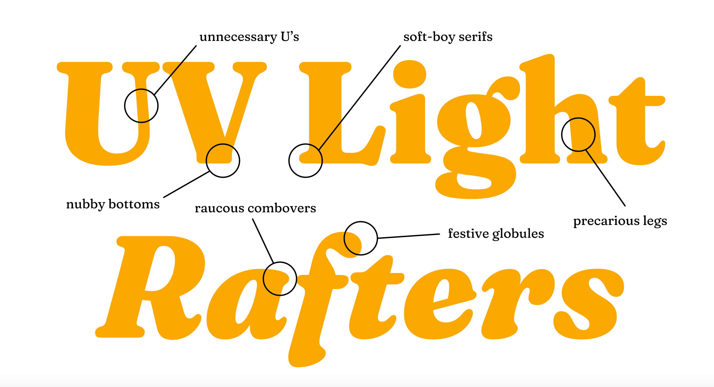
Our hero display font, Fraunces Extra-Bold, is designed by by Phaedra Charles and Flavia Zimbardi at Undercase Type. It’s full of curvy, curly flourishes and shapes that jostle and nestle together.

Our ‘body’ typeface, Overpass, was designed by Delve Fonts, and is inspired by roadside signage on federal highways, making it highly legible at speed.

Our new brand palette is built around a rainbow of seven colours with three tints apiece. We use an ultra-dark blue (Midnight) and ultra-light orange (Oatmilk) instead of black and white, to create a softer look.

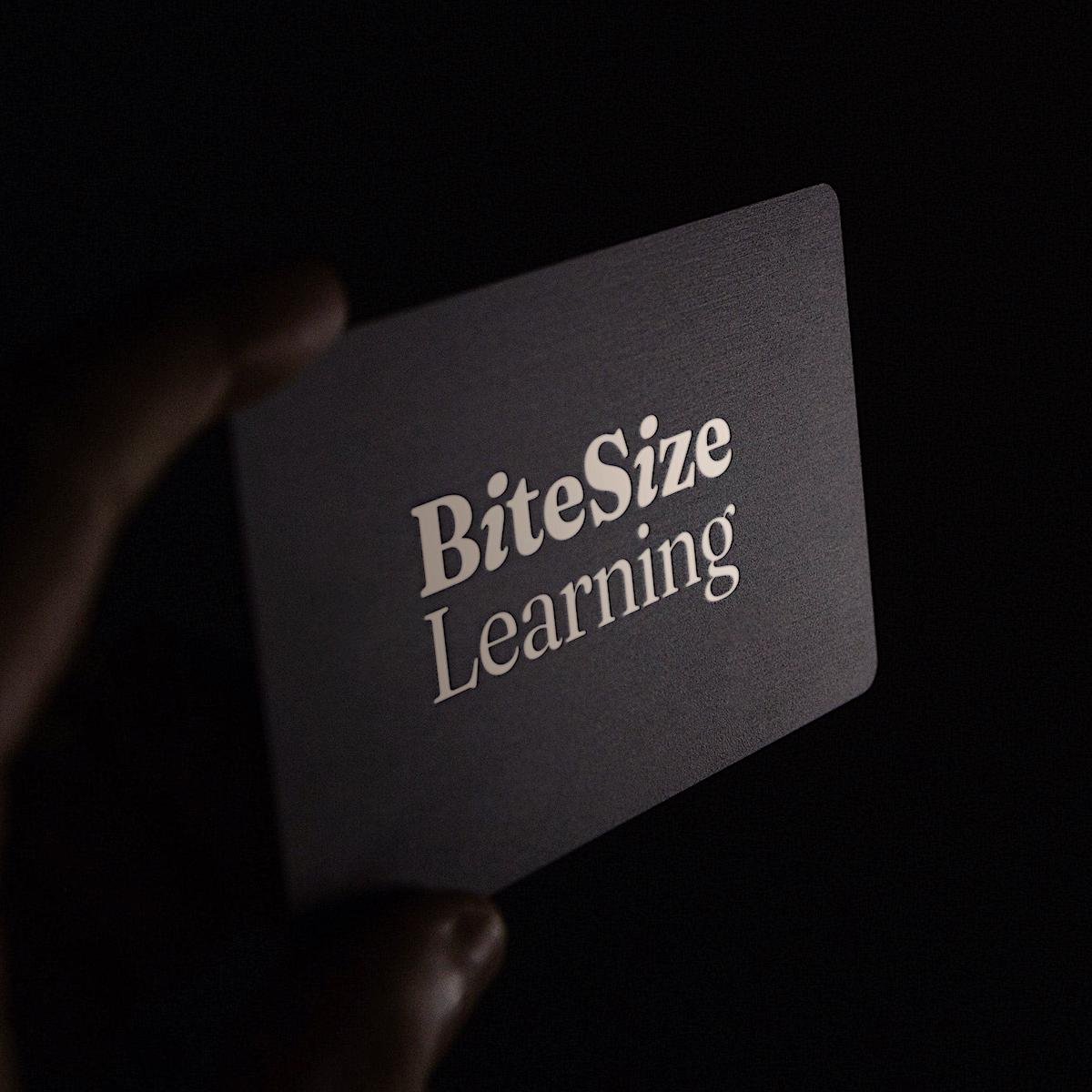
Our new logo is a plainspoken wordmark built in Fraunces. The i’s in BiteSize are italicised, adding some playful forward momentum, represent figures leaning into listen, and evoke theℹ information sign.
We use a ‘duotone’ colour treatment on stock photos, based on our brand rainbow, to create a more distinctive look and flatten the internal contrast of the image, in turn making our Fraunces headlines ‘pop’. Each of our training course categories has its own corresponding colour, from wellbeing to leadership.
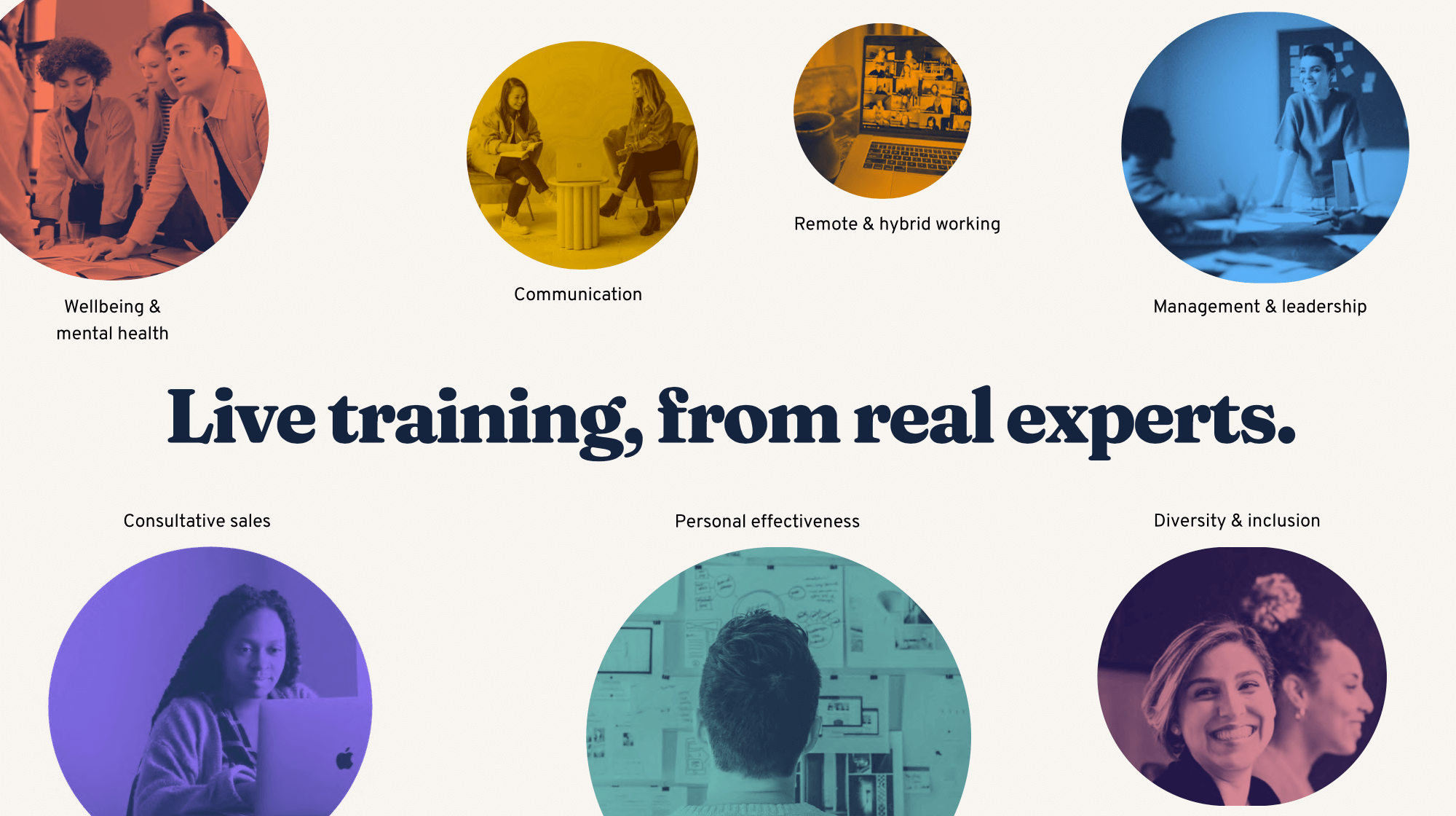
Maintaining continuity with our previous identity, our new look still makes use of colourful circles and icons, representing the stepping stones our course attendees take on their professional learning journey.

Putting our new look to work 🎨
With a new store cupboard of visual ingredients, we were now ready to start cooking up new recipes.
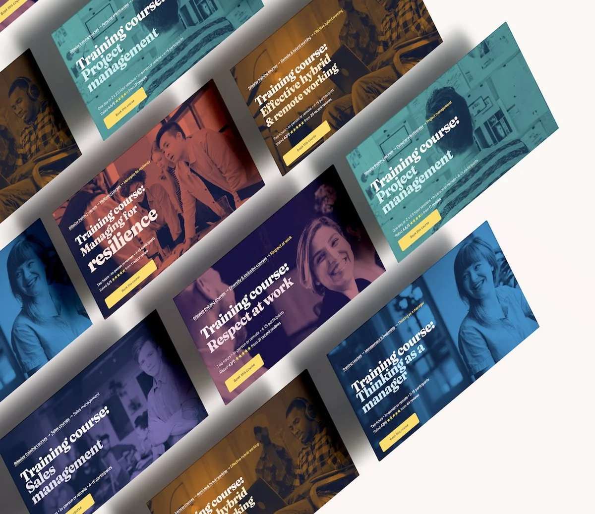
That meant rebuilding all our existing content across training and marketing…
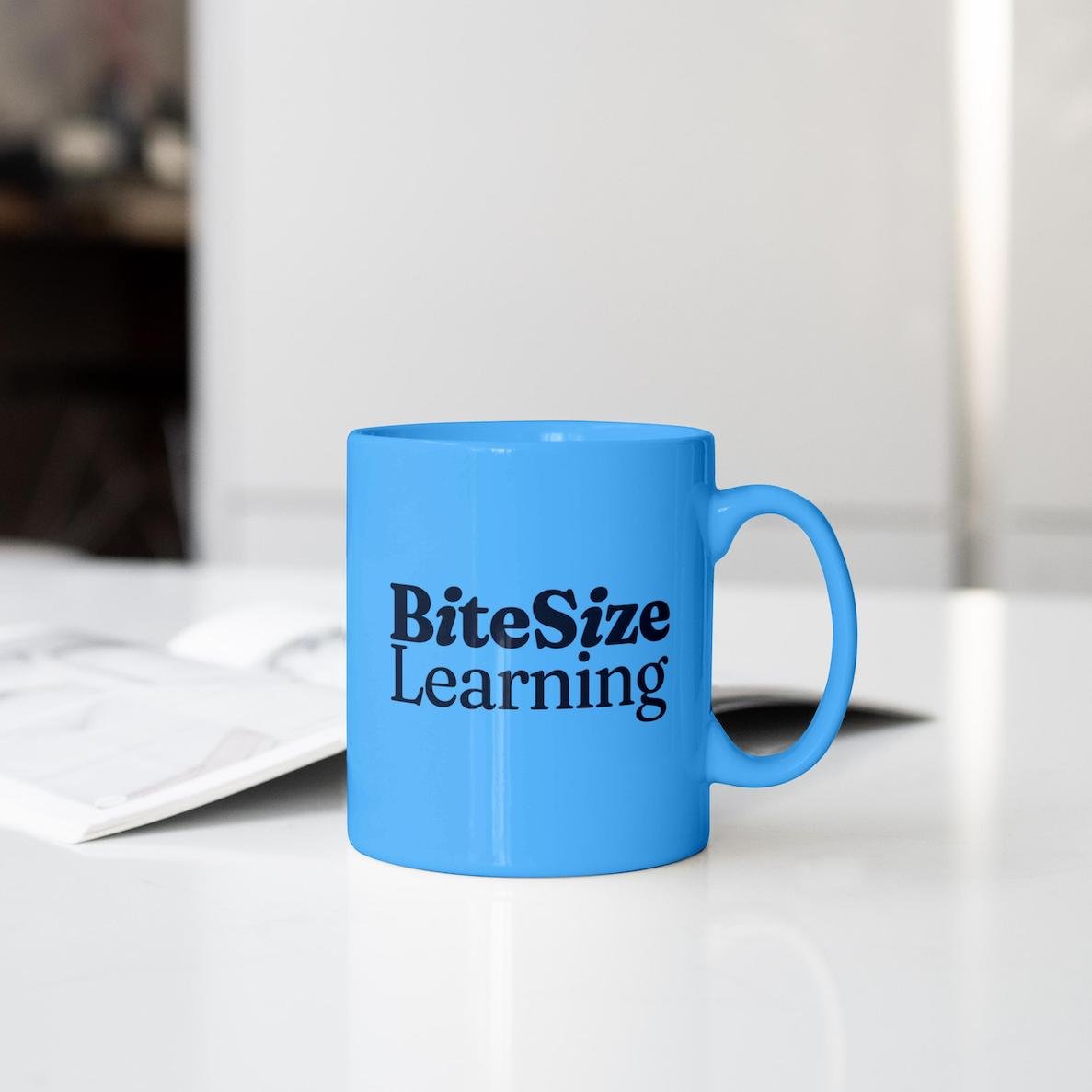
As well as visualising new uses for our brand in the future. (Mugs not yet available in all good gift shops.)
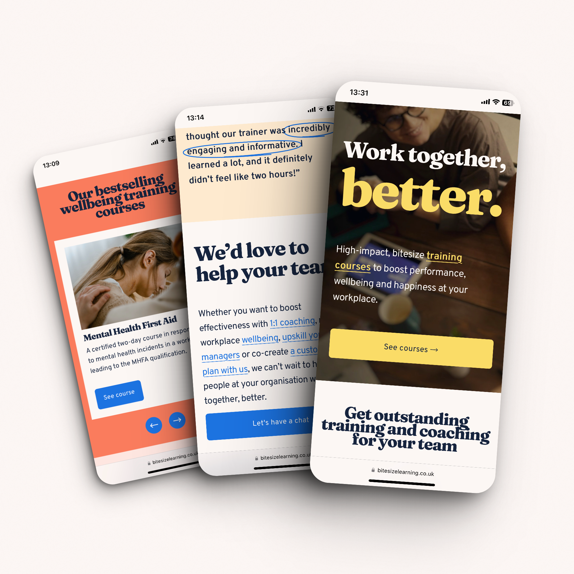
While our previous visual identity was created primarily with PowerPoint presentations in mind, our new combination of fonts and colours makes BiteSize Learning easy to recognise wherever you see us! Keep your eyes peeled on the streets…


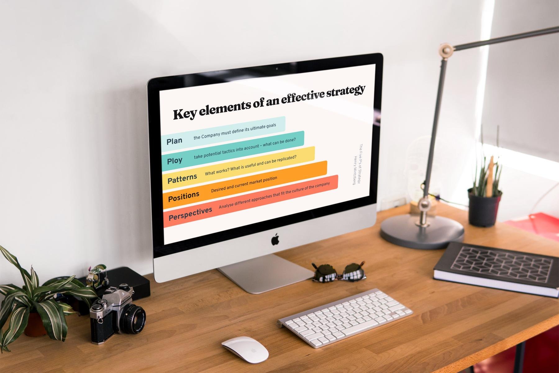
A little mockup from our design deck.
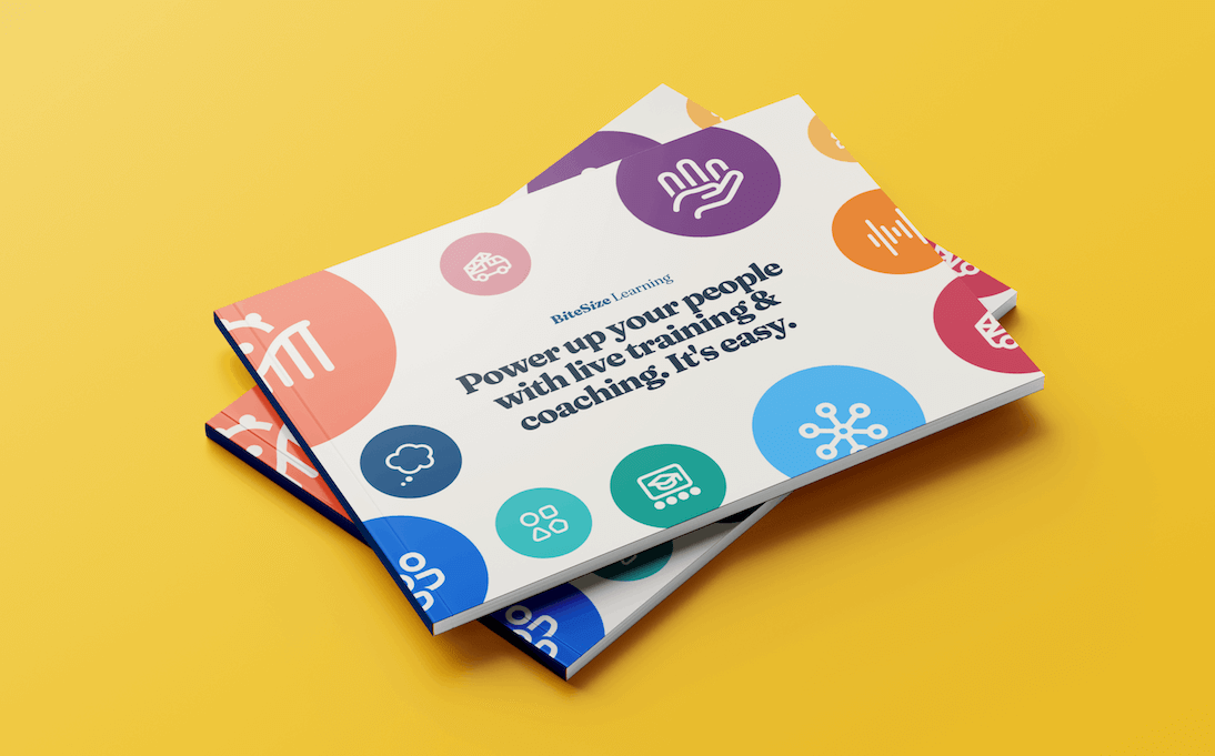
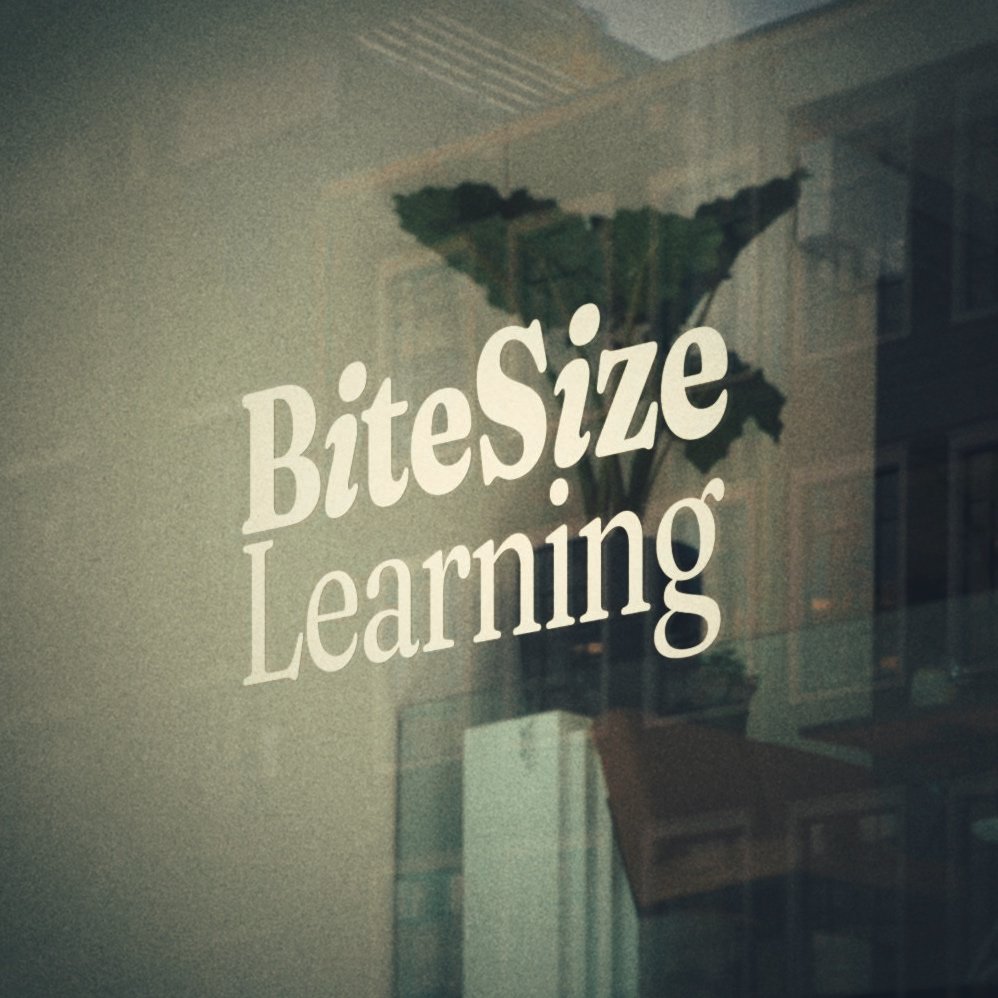
Considering the new brand in print form.

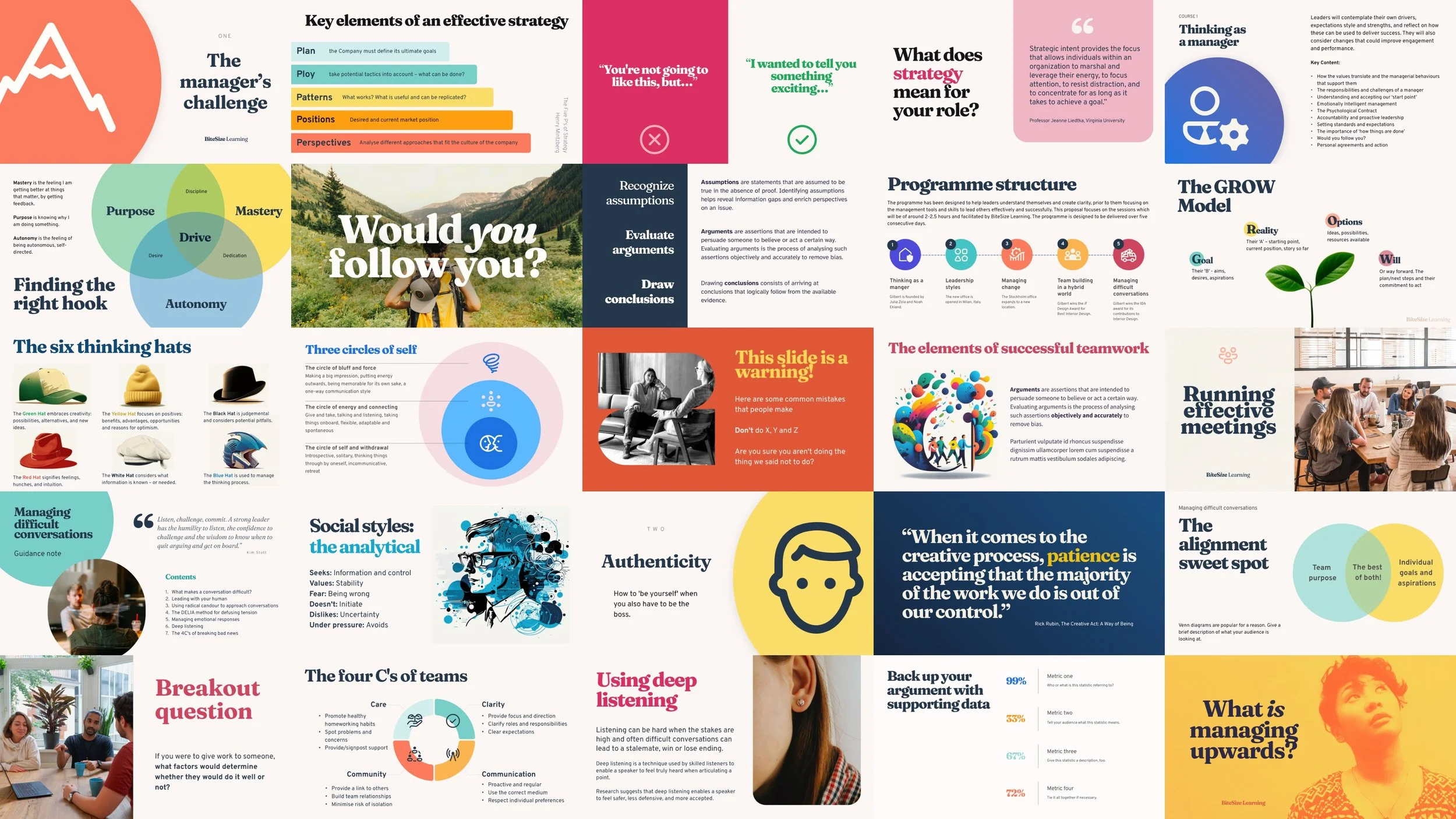
As a training company, we naturally have a shed-load of instructional materials to rebrand: thousands of slides, for starters, across 74 different courses. (And that’s before you include the bespoke training sessions we design for our clients!) We mocked up over 300 layouts during the design process, to make sure there’s no matrix, model or process we can’t visualise with our new look and feel.
Our rebrand toolkit 🧰
Even a few years ago, a project like this would have been difficult for a team like ours to handle in-house. But fortunately, there are now more tools than ever that empower growing businesses to seize control of their own brand wardrobe. Here are a few tools we found really useful!
Pitch for presentation design and internal collaboration
Canva for other marketing design
Pinterest for research and moodboards
Unsplash and Pexels for stock photography
Duotone (by ShapeFactory) for colouring photos
Google Web Fonts for making Fraunces and Overpass available everywhere
Squoosh for compressing images
MidJourney for generating illustrations
Squarespace for our website
Mr Mockup, Unblast and shots.so for mockups.
A bold new look, the same core values ❤️
Any rebranding exercise is a chance for an organisation to take stock and reflect on who it really wants to be. Here at BiteSize Learning, we realised we sill wanted to be ourselves – we’re proud of how we do business, how we treat our customers, and the impact of our work. So although our fonts and colours may have received a make-over, deep down our work is still driven by the same brand values.
We’re caring. We care about our clients, participants, trainers, employees and suppliers. We care about the long term impact of our training. We want people to really want to work with us.
We’re ambitious. We’re fuelled by an ambition to deliver outstanding results and become the very best in our chosen field. We’re always seeking to grow, improve, and help our training customers grow, too.
We’re reliable. We always keep our word. We do what we say we will. When customers work with us, they can trust us to do the right thing.
We’re inclusive. We value diversity, and we strive to be fully inclusive and dare to be different.
We’re generous. We share with a generosity of spirit, and a belief that trust is both rewarding and rewarded.
We’re curious. We are always learning new things – and sharing what we learn with the world. We believe every experience is a learning opportunity.
